Updated November 2017
A great company blog accomplishes multiple goals at once. It engages readers by providing relevant content and directs them to explore the company further. It also encourages readers to share content on social media, giving the business an even wider reach and attracting more potential customers.
A company blog should serve as a massive driver of top-of-funnel traffic which creates a mutually beneficial scenario: readers learn what they came for and your company gains share of mind and awareness while increasing search visibility. Blogging should stimulate ideas! Posts should jump off the page with innovative thinking that your audience has never considered before!
Sounds simple, right? Unfortunately, creating a good corporate blog isn’t as easy as it seems.
To help you out a bit, we’ve rounded up three of the best examples of company blogs we’ve seen this year. If you’re planning a redesign or simply want a more effective strategy in 2018, keep in mind the strengths we highlight below and adapt them for your own company:
1. JP Morgan Chase masterfully spins evergreen content
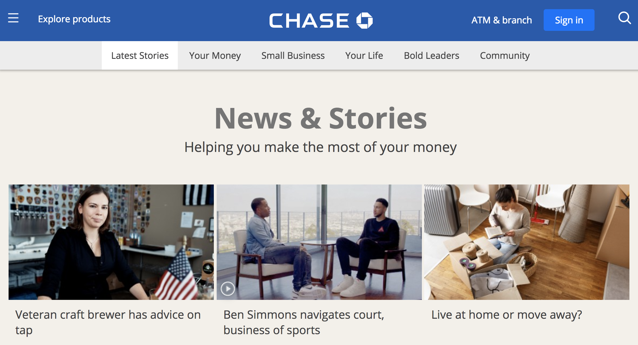
Chase’s News & Stories page does practically everything right. Its design is sleek and coherent, and the first page is loaded with content that’s varied and yet still targeted to Chase customers. Header navigation follows you as you scroll down the page, and the responsive layout is accessible on a number of screen sizes.
However, where this blog really shines is within the content itself: Chase is a master at adding a new twist to evergreen topics. The information that bank customers need doesn’t change much from year to year; the basics of buying a house, saving for retirement, obtaining a business loan and the like tends to remain the same. Shifts in market rates or legislative updates happen on occasion but certainly not frequently enough to keep customers’ interest.

Yet Chase expertly manages to discuss these topics in multiple ways without the words becoming stale. It does this by tailoring its approach to a particular demographic: young adults. Scan the front page, and you’ll see articles aimed at both college students – “How to finance a gap year” – and young families – “The first car we bought as a couple.”
The information in these articles isn’t exactly new, but it’s written in an accessible, attractive way that informs readers new to these concepts. Personal stories of family and entrepreneurship effectively translate high-level financial concepts into a language young adults – who probably never thought about words like “refinancing” or “investment portfolio” before – can easily understand.
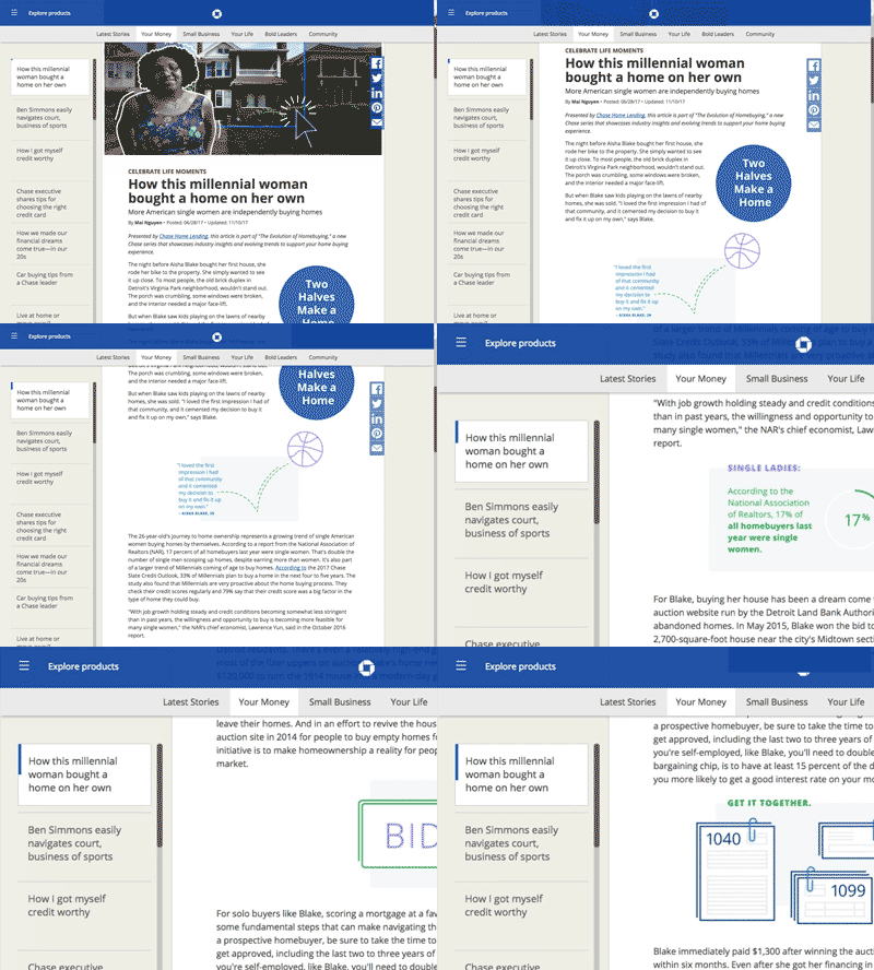
For a specific example, look at the article “How this millennial woman bought her first home.” The title alone provides everything the reader needs: It says whom the article is for and what it’s about.
The piece itself is a specific story about one person, interspersed with universal facts and statistics, some of which are emphasized through attractive graphics. Both of these elements help the reader picture themselves in the situation of buying a house, giving that person the confidence to start the homebuying process (through Chase, of course).
In addition, a list of related articles sits on the left of the page. The current piece is at the top of this list, and a responsive meter shows readers how much of the content they’ve read as they scroll down. This bit of eye candy keeps the reader engaged; in the age of the internet attention span, people are more likely to finish a full article when they know how much is left.

Overall, this blog has a lot of great points: appealing content, a purposeful layout and, most importantly, information that’s relevant to the Chase audience.
2. American Express purposefully directs readers to action
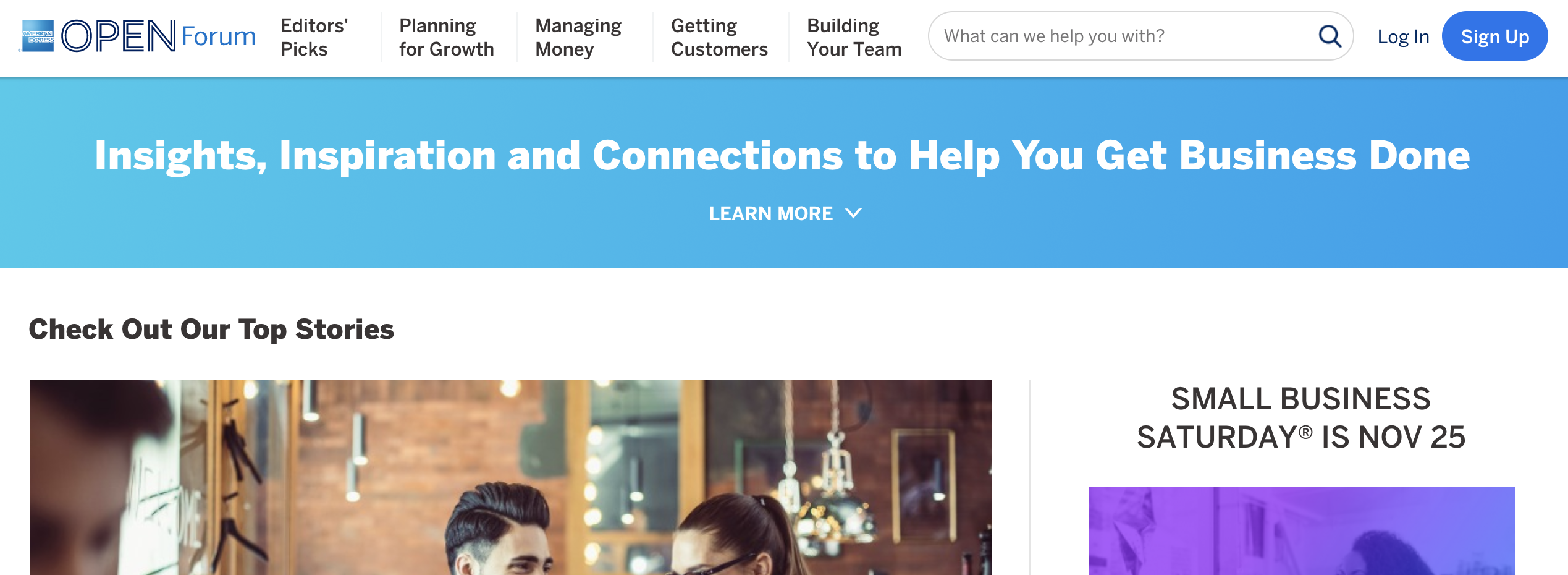
American Express’ OPEN Forum is the ultimate resource for small business entrepreneurs, and it’s widely regarded as a great example of content marketing. The website does a great job of promoting its best-performing pieces, with separate sections for top stories, editor’s picks and what other people are reading.
OPEN Forum’s search bar is particularly noteworthy. It’s right up top, whereas a lot of company blogs hide their search function within drop-down navigation or at the bottom of the page. Some don’t even provide a search function at all, which is very frustrating for visitors wanting to read about a specific subject.

Thankfully, OPEN Forum puts its search function right at the top and asks the reader, “What can we help you with?” This is a nice touch, as it reinforces the company’s values of customer service and support.
That said, OPEN Forum’s biggest strong point is the fact that every part of the site compels users to take a specific action.
Each article is topped with icons for sharing on social media or through email, making it simple for readers to respond to each piece. They also have a number of calls to action, some linking to other articles that might pique the reader’s interest and others guiding visitors to join OPEN Forum.
Finally, the bottom of each article has an additional CTA encouraging readers to follow the author. The social sharing icons are also repeated, so visitors don’t have to scroll back to the top of the page if they want to promote its content. Little conveniences like this dramatically increase the likelihood of visitors sharing an article or video.
OPEN Forum’s numerous calls to action exemplify exactly what content marketing is meant to do: guide potential customers through the sales funnel. A blog is most effective if it directs visitors to engage with the company even further rather than simply read an article and leave.
Two of the biggest mistakes we see with blogs are those that try to be too salesy, which turns readers off, or those that don’t provide an action for the user to take when they finish reading an article.
OPEN Forum easily avoids both of these pitfalls by creating purposeful content intermixed with actions for the reader.
3. Casper skillfully attracts customers at the top of the funnel
Now it’s time for a nap.
Wait, that’s wrong, it’s time to read about naps. Or, more specifically, about sleep in general.
Casper, the mattress e-commerce company, once had two corporate blogs. One, attached to the Casper website, is very promotional. Its main focus is on company news and the benefits of their mattresses.
Casper’s second blog existed under a completely separate website and name: the cleverly titled Van Winkle’s. Though it recently announced plans to shut down, Van Winkle’s had some great elements that make it one of the year’s best.
In terms of design, Van Winkle’s was pretty no nonsense. The header was simple, with three article categories, a search feature and social media engagement buttons. A banner up top collected reader email addresses for a newsletter roundup.

However, the website was a great example of attracting users at the top of the funnel, specifically by focusing on an underreported element of a popular industry. Health and wellness is a huge market, and while some companies may publish an article about sleep here and there, none of them focused specifically in this area until Van Winkle’s. With a group of experienced editorial staff, Van Winkle’s acted as a separate venture, publishing first-person accounts, scientific research, investigative features and emerging therapies all dedicated to the concept of sleep.
At first, the publication doesn’t seem to be that good of an example of content marketing. After all, the only mention of Casper was in the site’s footer. What’s more, a separate website for content lacks the domain authority of the original, which doesn’t help search engine optimization efforts.
However, by creating a completely separate archive of content, Casper captured customers at the very top of the sales funnel: people looking for better sleep solutions. These individuals may not have even known they needed a new mattress, but they hopped on the wellness trend and were interested in any news or product that will improve their sleep or make them feel healthier.
In essence, Casper saw an opportunity to dominate the sleep conversation and went for it. The company could then increase its marketing efforts toward visitors who sign up for the Van Winkle’s weekly newsletter or navigate to Casper.com from the Van Winkle’s website.
Like with OPEN Forum, each Van Winkle’s article had social icons at the top. The content itself is certainly share-worthy, and I wouldn’t have been surprised to see titles like “Scientists discovered sleep in jellyfish” and “Help! I haven’t been able to sleep since my cat died” all over Facebook with thousands of comments.

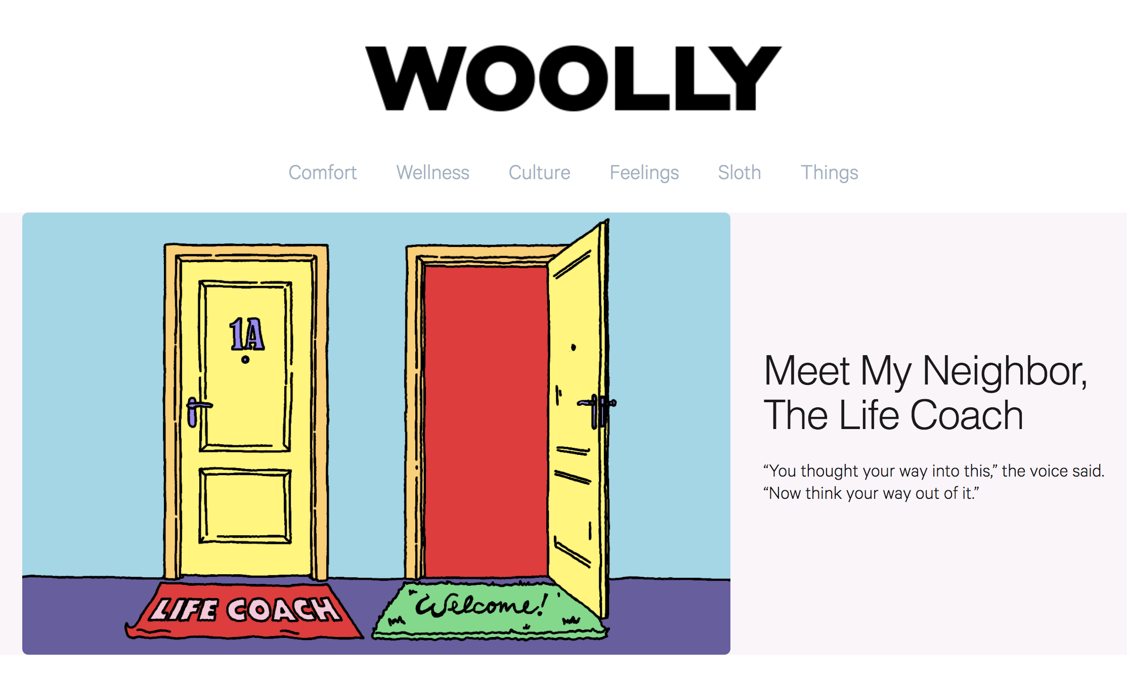
P.S. – If you can bear the thought of living in a world without a blog about sleep, check out Capser’s new venture: Woolly Magazine! It will have similar content to Van Winkle’s with additional articles about wellness.
Some final thoughts
We’ve seen some great content this year, and we’re excited to see what creative, clever ideas 2018 will bring.
That said, some essentials of content marketing will always remain the same. Engaging customers with well-written content should always be top priority, which is why company blogs should target a specific audience and encourage readers to take an action.
Dive into your analytics and demographics data and find out which kind of content is performing the best. Perhaps you will find out that your mid-funnel content rather than blog posts resonate with vice presidents and C-level execs. Creating excellent content is half the battle, the other oft-forgotten half requires extensive analytics work to determine whether or not your content is reaching your potential customers in a meaningful way.
The three blogs above achieve these goals particularly well, each in their own way.
Know a company blog you think is one of the best? We’d love for you to share your insights with us!


